
bank hapoalim

bank hapoalim
bank hapoalim
COMPANY
bank hapoalim
project context
Industry Collaboration Project
Year
2025
In short
A collaboration between Google-Reichman students and Bank Hapoalim as part of an internship project, focused on improving the credit card ordering process in the bank’s app.
The result: a unique and forward-thinking flow in Israel, combining a top-tier user experience with the bank’s business goals
A collaboration between Google-Reichman students and Bank Hapoalim as part of an internship project, focused on improving the credit card ordering process in the bank’s app.
The result: a unique and forward-thinking flow in Israel, combining a top-tier user experience with the bank’s business goals
The mission
to transform Bank Hapoalim’s mobile credit card ordering into a seamless, customer centric journey
The mission
to transform Bank Hapoalim’s mobile credit card ordering into a seamless, customer centric journey
The mission
to transform Bank Hapoalim’s mobile credit card ordering into a seamless, customer centric journey


Research review & Inspiration
We started by researching the existing flow, analyzing competitors, and drawing inspiration from leading companies around the world.
Research review & Inspiration
We started by researching the existing flow, analyzing competitors, and drawing inspiration from leading companies around the world.
Research
review
& Inspiration
We started by researching the existing flow, analyzing competitors, and drawing inspiration from leading companies around the world.


We found that...
We found that...
We found that...

It’s all about the
experience
It’s all about the
experience
Can't wait?
Here's the full prototype
Can't wait?
Here's the full prototype
Can't wait?
Here's the full prototype
1
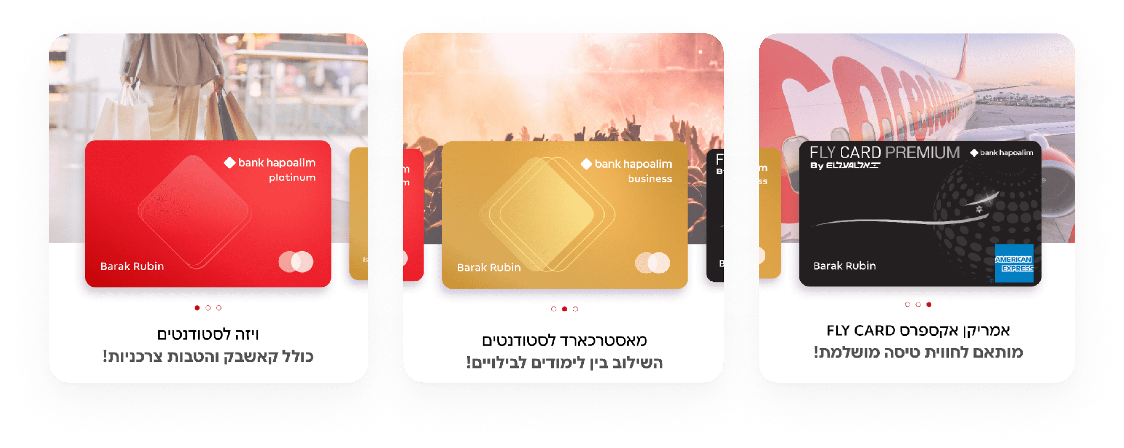
Our first breakthrough was
giving users the option to choose what matters most to them in a credit card. That’s when we realized the entire process should be defined by personal, experience-driven customization

1
Our first breakthrough was
giving users the option to choose what matters most to them in a credit card. That’s when we realized the entire process should be defined by personal, experience-driven customization
1
Our first breakthrough was
giving users the option to choose what matters most to them in a credit card. That’s when we realized the entire process should be defined by personal, experience-driven customization
2
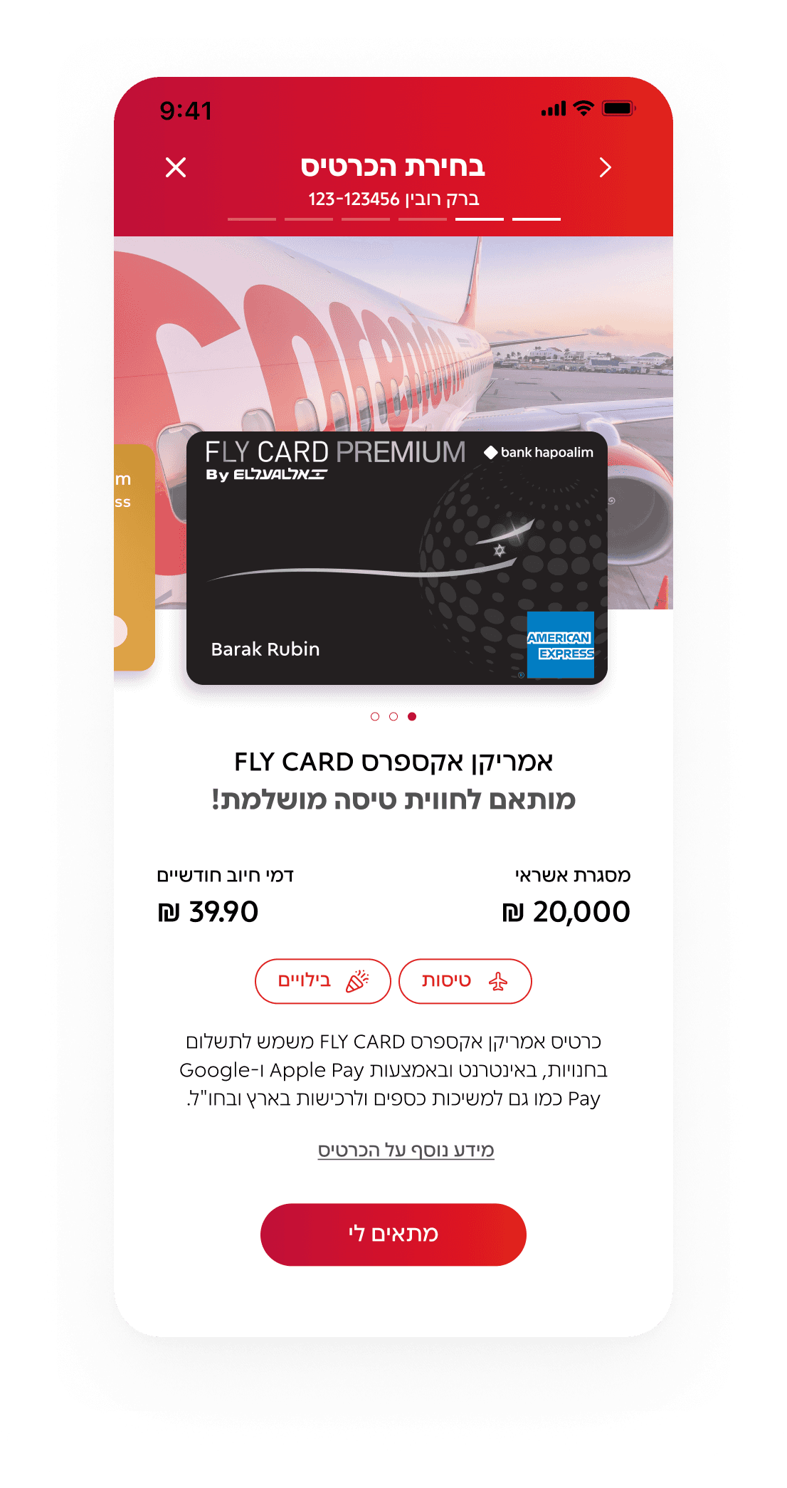
We found thta users often don’t understand the differences between cards and mainly care about the benefits. Since the card selection screen had high drop-off, we designed unique sections for each card, linked to the user's chosen tags, to clearly show each card’s strengths.
2
We found that users often don’t understand the differences between cards and mainly care about the benefits. Since the card selection screen had high drop-off, we designed unique sections for each card, linked to the user's chosen tags, to clearly show each card’s strengths.
3
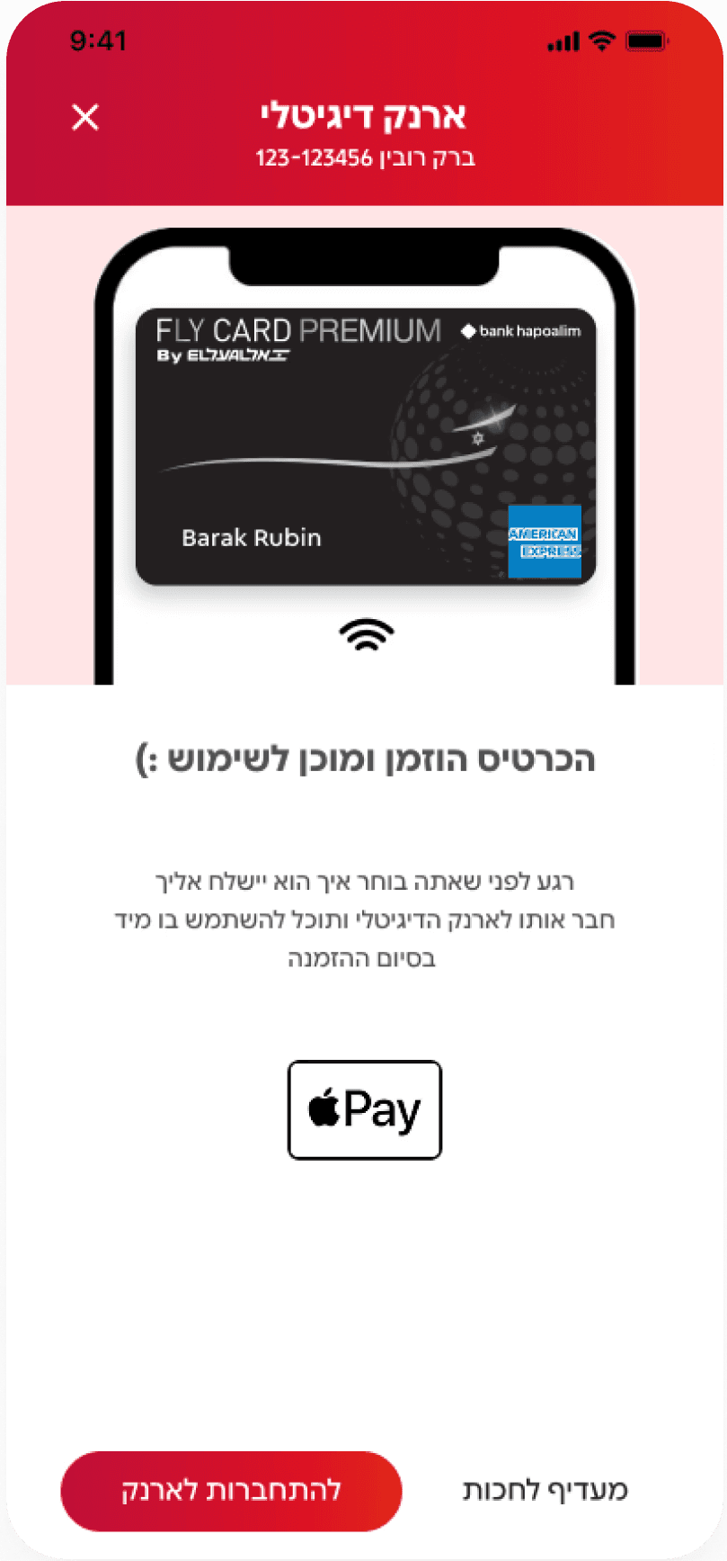
The bank aimed to connect cards to the digital wallet, but users often skipped it after ordering. So we blurred the line between the order screen and the wallet prompt making it feel like part of the same flow
3
The bank aimed to connect cards to the digital wallet, but users often skipped it after ordering. So we blurred the line between the order screen and the wallet prompt making it feel like part of the same flow

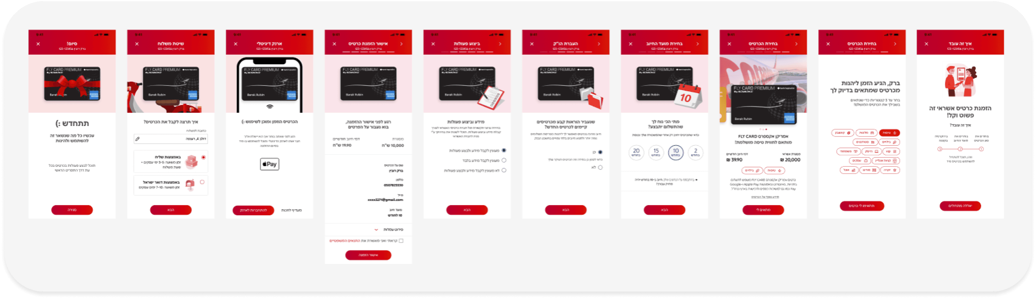
Bringing Flow to Life
The credit card stays with the user, while animated elements change to match each screen. It brings life and fun to a process that’s usually pretty dry or boring
Bringing Flow to Life
The credit card stays with the user, while animated elements change to match each screen. It brings life and fun to a process that’s usually pretty dry or boring

3
The bank aimed to connect cards to the digital wallet, but users often skipped it after ordering. So we blurred the line between the order screen and the wallet prompt making it feel like part of the same flow
2
We found that users often don’t understand the differences between cards and mainly care about the benefits. Since the card selection screen had high drop-off, we designed unique sections for each card, linked to the user's chosen tags, to clearly show each card’s strengths.

Let's make things happen!
Let's make things happen!
Let's make things happen!